Thursday, 21 March 2013
Wednesday, 13 March 2013
Monday, 11 February 2013
Audience feedback on print products.
After conducting audience feedback on our final finished ancillary products we found that many of our audience were particulalry fond of how the products looked, however there were a few minor changes we found that needed to be made. For example a few connotations of proffesional film reviews needed to be added in order to make our own review page seem of the likes of well written review magazines. Following blogposts will included the final print products we have composed taking in account these changes.
Wednesday, 6 February 2013
Film poster - so far.
at the moment we are in the process of producing the film poster and review page, this is how far we are at the moment. please could you leave some suggestions on what we could do further on the attatched survey.
survey.
http://www.surveymonkey.com/s/78RB8LD please complete this survey, we would appreciate your time in doing so.
Saturday, 2 February 2013
Print Products - Mock ups.
Today as a group using our case studies we created mock ups of put short film magazine review page and poster. These were formed on the basis of the findings within our case studies. We found similarities in the layouts, graphalogical features and the text placed on both products and therefore based our own print products on these. We have used conventions of real magazine reviews as well as posters and have shown how these will be illustrated on ours in appropriate places. Below are the mock ups of both products which we soon hope to pitch to a group of people for some constructive as well as positive criticism.
This is the review page with all the pieces of information along with images we hope to include. The traditional layout of a magazine review page includes a double page spread with a main image as the focus and text based around the page. Many pullquoutes and reference to sources of quotes along with a few images of the film itself and even a short portfolio of the characters.
This is the film poster layout we hope to create. From our case studies we gathered that the image plays the large role in emphasising and atracting the audience to the film itself and text on the poster is kept to a minimum. A few main pull qoutes are added along with key information such as the director/producers names.
Over the next few days we hope to gather studio photography for the poster and review page and we will be showing the formation and progress we have made whilst creating these step by step till the finished print products have been created.
Wednesday, 30 January 2013
Research & Planning film Case studies.
.jpg)
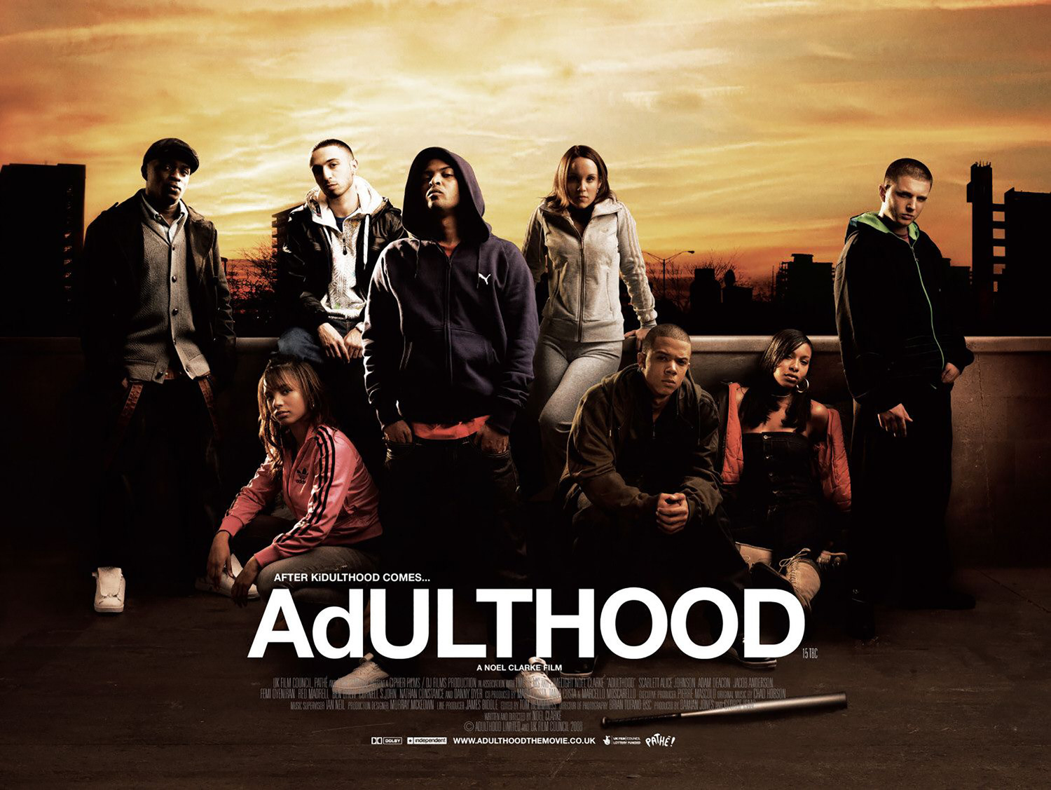
- The title of the film is in large bold (white) capital writing which catches the audience’s attention and automatically alerts them of the themes of the film.
- The line at the front allows the audience to be familiar with the fact that the film is based on life as a ‘kid’ before ‘adulthood’.
- The positioning of the characters reveals a great amount of information to the audience. For example the two males which appear to have their arms around the girls they are with symbolise they are together whilst the other 3 characters are positioned differently. The male on the far right is seen holding a baseball bat with his hood up which signifies that the role he plays within the film involves violence perhaps as well as him being a potential threat to the other characters.
Location clearly demonstrates that the film is based in
an urban environment as the background is quite dark and intimidating with
little signs of houses. This then allows us to form a judgement of the
lifestyles and ideas which we may come across in the film.
The film Kidulthood is of an urban setting with the characters being placed in their natural environment. As audience this is evident from the look of the location itself and the mise-en-scene. For example the clothing of the characters displays somewhat of the area they may come from, within this film the ‘street’ clothing signifies that the characters may come from an area which is more or less deprived, or even areas of which crime and deviant behaviour occur. This is due to the connotations such clothing hold within society and the negative views and stereotypes held towards the people who engage in wearing such clothing. Having such a portrayal of the characters ties in with the ideas and themes displayed within the film itself. Kidulthood revolves around teenage romance and hatred along with jealousy. Our short film itself is based around struggle and love and is also based around the same age group of Kidulthood with similar characters. Therefore this film poster can be used in helping us to produce or own as we can draw out the relatively achievable ideas and subvert these into our own.
- Title of the film is in bold capitalised letters with the colour standing out from the rest of the text and the poster itself. This captivates the attention of the audience straight away.
- Again the positioning of all the characters highlights aspects of the role they may play within the film. This is something we can insinuate from the mise-en-scene.
- The location of the characters appears to be what is known as a deprived area. This has been demonstrated through the dark lighting as well as the clothes of the characters. They are portrayed as wearing what is known as ‘hood clothing’, a trend commonly associated with teenagers. This dress code often depicts deviant behaviour.
Shot types
used within this films cover include a long shot of the characters on the
reverse as well as the character that appears at the front. The body language
of the characters appears to be quite stern with an intimidating look; this is
through the way they are positioned along with their posture and facial
expressions. One of the girls comes across as being seductive and this can be
seen through the way half her clothes are hanging off her shoulder. We can also
insinuate that the two characters who are sitting together may have a close
knit relationship as with the other two. However the character that appears alone
at the start may have some sort of a role which interrupts this relationship.
The fact that the story line of the film is based around teenagers and love and
relationships is significant as the short film we have produced involves a
similar storyline along with the same sort of characters. We have characters
that are motivated by causing disruption to others as well as characters who
are in a relationship and portraying them in the way that this film has done so
with its characters can be a potential idea. We could have studio photography
with a background that suits well to create the effect that the producers of
this film have. The text is minimal as the focus is on the characters
themselves signifying the importance they play within the film.
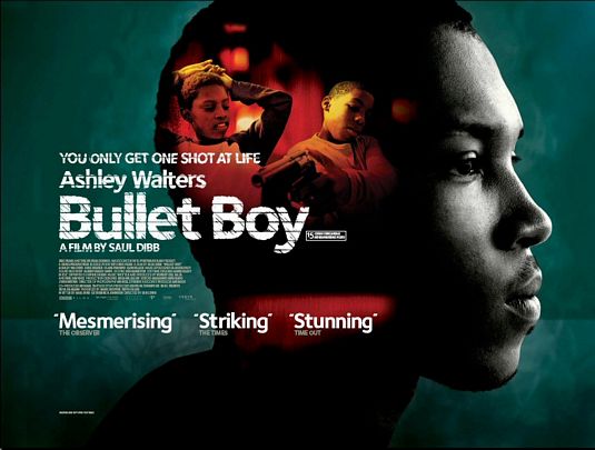
This is another film from the makers of Adult &
Kidulthood. As we can see this is completely different from the other two
however its conventions are as strong as the others. To begin with the image
itself plays a large role in demonstrating as well as revealing the potential
themes and ideas we as the audience will come across. The use of the dark image
connotes that the characters are almost in a misery, particularly the character
of whose picture has been used as the main image. A dominant feature of this
film poster is the fact that the characters have been placed in the head of the
character at the front; this could mean the case of the characters playing a
significant role in the main characters persona within the film itself. Moving
towards the text which has been kept to a minimum, it is evident that the film
deals with aspects of crime/deviant behaviour (bullet) the typography itself of
the text has slits through the letters the idea of the bullet travelling
through the person it is aimed at. Furthermore the buzz words towards the
bottom have been used in a triplet this could be to emphasise the key aspects
of the film, they could also be words which have come from potential viewers of
the film who have left reviews. This idea is particularly successful as it
engages and intrigues the audience towards the film itself. The use of the plosives bullet boy stand out
to the audience and draws in their attention.
Photoshoot for print products.
Today we conducted our photoshoot for our printproducts, this was studio photgraphy which we have generated in order for our poster and review page to have the best possible conventions of the likes of proffesional media products. We have used various shots and will be deciding which ones are fit for purpose. We also will be showing the progress from the start to the final finished products. A selection of images will soon be up on the blog!
Tuesday, 29 January 2013
Subscribe to:
Comments (Atom)


.jpg)


